Mobile Hotel Search
About SAP Concur
SAP Concur is an integrated travel, expense, and invoice management SaaS product. They have more than 700 partners in their partner ecosystem. With 92 million users across more than 46k organizations, their customers rely on SAP Concur's suite of products to manage business travel and expenses.
Project Overview
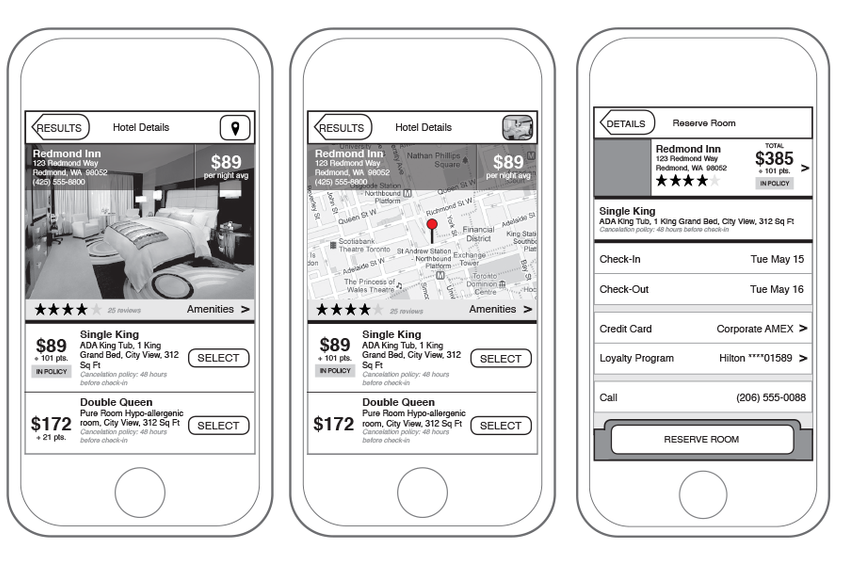
As part of a "make it better" initiative at Concur, I was asked to re-invision what the hotel booking experience could be on our mobile application. The experience had not been updated since it was initially launched two years prior, and the general feeling was that while it worked fine, it was lacking some features and up-to-date design compared to consumer apps on the market. We wanted our mobile app to be where users booked their business travel because they *wanted* to use our application, not just because they were bound by corporate policy to do so.
I spent some time researching and evaluating consumer travel applications and putting together a document showing some of their more interesting features and key commonalities between them. Based on this competitive analysis, I identified some key features where we could improve our own product, and set to work designing those experiences in wireframes.
Outcomes
The work I did ended up putting the initial "make it better" vision to the side, and helped get executive buy-in for a longer-term overhaul of our entire mobile booking process. The ideas I generated helped the business understand the extent of work that was needed to substantially improve the user experience of mobile booking, and the wireframes I created provided an initial roadmap for that work.
Takeaways
Okay, biggest change I would make on this project would be to not do it in InDesign. It was a weird choice that I can only imagine I made because at the time (2014-ish?), most design was taking place via Photoshop or Illustrator, neither of which allowed the designer to make typographic changes to all of the screens in a single design file at once. (Though to be honest, that's kind of a challenge in modern design software, too.) I can understand why I did it (it was useful to page through the designs for presenting them to stakeholders without leaving my design software, for one thing), but it's really made it challenging to continue to get this piece up in my portfolio anytime I've redesigned it. I keep it in because even though the actual features displayed seem very pedestrian 10 years later, you have to remember that the travel booking experience looked a LOT different 10 years ago than it does now. I guess I think it's kind of neat that I worked on things back then that are just default interaction assumptions these days.


